How we display alert banners
An alert banner (or notification banner) tells users something they need to know outside of the page they're on.
For example if:
- phone lines are down
- an online form isn't working
- the IT team is carrying out maintenance work that will affect how our digital services work
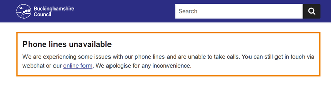
Example
When not to use this pattern
You should use alert banners sparingly. People may scan past them if they're used too often.
Do not use an alert banner to:
- push communications messaging such as events, newsletter sign-ups, or consultations
- provide an alternative to a website error message
If the information relates to a task the user is doing on that page, then try to incorporate the information into the webpage. For example, by using inset text to make it stand out at the relevant point.
Colour and positioning
Alert banners appear at the top of the page, above the page title.
They consist of a title, body text and border.
There are 3 alert levels each with a different colour. The level you choose depends on the severity of the alert.
| Alert level | Colour | When to use |
|---|---|---|
| 1 | Black | For nationwide crises and emergencies, such as terror attacks or the death of a monarch |
| 2 | Orange | For high impact issues such as phone lines going down or digital services being unavailable |
| 3 | Blue | For low impact messages such as changes to bank holiday opening hours |
Character limit
The body text of the alert banner is limited to 240 characters.
Use short, declarative sentences and as few words as possible.
You can include hyperlinks if you need to point users to another page.
Help with this pattern
Contact the webteam via ServiceNow if you need to:
- ask a question
- get help with this pattern
- get help with writing content
- make a suggestion for something we need to include in this guidance